
Site.com strips out the media query definition from a CSS file when you try to import it, and if you try to manually edit the CSS file by adding the media query, you cannot save the file. Instead you receive the error message:
The CSS code contains mismatched or missing brackets. Ensure your CSS is formed correctly and try again.
Does anyone know a way around this?
Attribution to: Sean Russell
Possible Suggestion/Solution #1
Unfortunately this is a known limitation of the Site.com platform. The CSS parser that is being used does not support some of the newer CSS3 features, such a media queries.
There are a couple of workarounds available if you can't wait for salesforce to fix the issue. These workarounds won't show the styles in the studio (like when you use the CSS editor), but when you preview the page they should be visible.
Import an external style sheet in the Head Markup
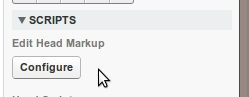
By selecting the page and then clicking Edit Head Markup under Scipts (see image above) you could add a reference to an external style sheet that contains any CSS you want using a link like the following:
<link rel="stylesheet" type="text/css" href="mystyle.css">
Include a style directly in the Head Markup
Using the same steps as above, you could also add your CSS3 styles directly on to the page:
<STYLE type="text/css">
   @media screen and (device-width: 800px) { color: red; }
</STYLE>
Use a Custom Code block
Markup in a Custom Code block doesn't get validated, so you could include something like this:
<div id="test" style="background: -webkit-linear-gradient(top, #2F2727, #1a82f7);
background: -moz-linear-gradient(top, #2F2727, #1a82f7);"/>
Attribution to: Ryan Guest
Possible Suggestion/Solution #2
Media Queries are now supported in site.com, as Peter Knolle mentioned. Open a CCS file in site.com, and in the action menu (the little gear with the down arrow, to the right of the css file name, add a new Style Item. Insert your media query code. Save.
Here is a sample:
@media only screen and (max-width: 767px)
{
    table.responsive { margin-bottom: 0; }
    .pinned { position: absolute;
              left: 0; top: 0;
              background: #fff; width: 35%;
              overflow: hidden; overflow-x: scroll;
              border-right: 1px solid #ccc;
              border-left: 1px solid #ccc;
    }
    .pinned table { border-right: none;
                    border-left: none;
                    width: 100%;
    }
    .pinned table th, .pinned table td { white-space: nowrap; }
    .pinned td:last-child { border-bottom: 0; }
    div.table-wrapper { position: relative;
                        margin-bottom: 20px; overflow: hidden;
                        border-right: 1px solid #ccc;
    }
    div.table-wrapper div.scrollable { margin-left: 35%; }
    div.table-wrapper div.scrollable { overflow: scroll; overflow-y: hidden; }
    table.responsive td, table.responsive th { position: relative;
                                               white-space: nowrap;
                                               overflow: hidden; }
    table.responsive th:first-child, table.responsive td:first-child, table.responsive td:first-child, table.responsive.pinned td { display: none; }
}
Attribution to: eyewell
This content is remixed from stackoverflow or stackexchange. Please visit https://salesforce.stackexchange.com/questions/3811